My Apple whoredom continues. Yesterday at promptly 5 o'clock I went to the Apple Store on Michigan Avenue and stood outside in a four-block line (I was in the middle of the third block) in order to grab up Apple's new system software as soon as it became available. I ended up waiting 45 minutes just to get into the store, but the process moved quickly after that. More importantly, I was able to grab the free "special-edition" Apple T-shirt.
Installation was a breeze; it took my machine about an hour to scan the DVD for consistency (?!) and then install the upgrade. I believe this would have taken much longer if my hard drive were even remotely full, but I have almost 80 gigs free, so the installation required no defragmenting or optimizing.
I've spent most of the morning becoming acquainted with the new features, and without further adieu, I offer my own personal guided tour. Click on the screenshots to see larger images.
DESKTOP
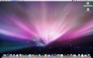
This first image illustrates some of the most basic cosmetic changes. The Aurora desktop image is the only new "official" image I've noted, but it matches the look of everything else Leopard-related. You can't really see it here, but the menu is translucent, and all the menu lettering is clear without being obstructive to whatever is behind it. On the right side of the menu bar, I have added the Spaces pull-down menu, which allows you to choose from several different sets of windows that you have open (so that your desktop is not cluttered with everything at once). More on that below. You will also note that I have a "backup drive" icon underneath my hard drive icon; this is the external drive I have attached that it is constantly utilized by Time Machine (also more below). The dock is a bit different, too—note the 3D look and the way the application icons stick up into the atmosphere.
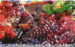
In this second image, I've reset the desktop background to the image of the molten strawberry I've been using... This more clearly illustrates the see-through quality of the menu bar and menus.
COVER FLOW
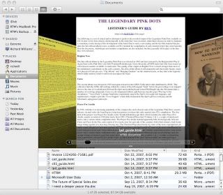
Mac OS X has now implemented the cool Cover Flow feature from iTunes into all of its Finder windows. In fact, now all Finder windows more closely resemble iTunes. In this example above, I am flipping through the files in my Documents folder using Cover Flow... You can see web pages, PDFs, Word documents, etc. represented in a visual format that flows very smoothly. The Cover Flow button is right next to the other View options: icons, list, and columns. Other window differences: the sidebar now resembles iTunes, and includes "smart" searches for items from particular times and of particular file types. Shared external drives now appear over here instead of on the Desktop.
QUICK LOOK
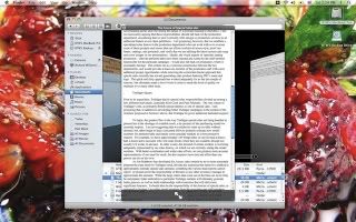
If seeing a thumbnail preview in Cover Flow isn't good enough (PDFs even allow you to flip through pages in Cover Flow!), you can now view files using Quick Look. When you right-click on a file and open Quick Look, a special viewer window pops up, in which you can read/see the entire document, regardless of what application created it. Thus, if you just want to read a Word file, you don't have to launch Word, etc. You can also cycle through your files in Quick Look mode, or view them in full screen. This is especially helpful if you're looking for a particular document but don't remember what you've called it.
SPACES
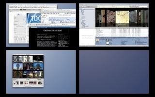
Spaces is simply an organizational mechanism by which you can put particular windows into groups. This simulates the effect of having several available desktops at once. In the above example, I opened a bunch of web pages in Safari and then switched to a second space, where I've got iTunes running, and then a third, where I'm playing with Photo Booth. This way, if I'm doing something with photos or music and suddenly want to look something up online, I can just switch back to the first space and browse; nothing needs to be closed or shuffled in order to see what I'm doing. The pull-down menu that I added to the menu bar allows you to choose between spaces; you can also set a function key (i.e. F8) to pull up the view that is featured in this screenshot. Like Exposé, you can just click on the space in which you want to work.
TIME MACHINE
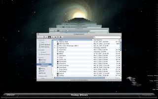
OK—Time Machine is most definitely Leopard's star feature and the reason why you might want to upgrade. It *requires* an external drive. Once you've upgraded, it will perform one major backup, copying your entire system to the external drive, and then at regular intervals it will copy the changes you've made, so that you have a continuous index of your files going back in time hourly for a 24-hour period, then daily, then weekly. When you launch Time Machine then, this screen comes up. The window you have open gains a third dimension - and you can literally view it progressively back through time to find the snapshot that might unveil a file you've accidentally deleted or an earlier version of something you've changed. This state is then completely restorable - so you basically will never lose another file again.
If you don't have an external drive, you really can't use this feature, as it won't work directly on your startup drive. If you don't have an external drive, I'm not sure I'd recommend Leopard, but at the same time I might recommended buying one so that you *can* upgrade.
PHOTO BOOTH



Photo Booth has added some fun new effects. Most of these include adding backgrounds to your picture. You can also film brief movie segments as well as snap photos. This roller coaster effect is pretty funny in still shots, but it's even better in motion. Some day I will learn how to post/stream video clips.

Similarly, this picture features a background in space, which matches the Leopard theme. This one doesn't look very good; the quality of these images depends on how carefully Photo Booth can render out your actual backdrop. If anything moves or the lighting changes, it won't really work. But the picture shows off my Leopard T-shirt a little better! (The back of the shirt features a tiny white Apple logo near the top, over a caption that simply reads, "Add a new Mac to your Mac" and a tagline introducing Leopard.)
VERDICT
All in all, I'm enjoying the upgrade. I feel that the new features fit seamlessly into the look and feel of the OS, but I can't say it feels like a major step forward. Yes, everything on the Mac is starting to feel even more consistently stylized and coherently integrated than it has been in the past; most applications are beginning to depend on their abilities to function with the others. But all of these improvements are ultimately just a streamlining toward something more impressive and enjoyable to use without actually adding many incredible new functions that weren't there before. Mail and iChat have also undergone some new upgrades, but the main reason to get Leopard is for Time Machine.

2 comments:
I heard a rumor that Google Chat won't work with Mac. Is this true?
Mac offers its own chat application, called iChat, which features multi-way video conferencing and utilizes outside AIM accounts, Jabber accounts, and Bonjour accounts. If Google has opted not to support the Mac platform to its fullest extent, this is a shortcoming of Google, not of Apple.
Post a Comment